Investor Onboarding, Inside a System Already Being Built
A PRD already existed when I joined - general, high-level, drafted before any of the discovery a project like this needs. The deadline was set by business commitments, not by design readiness. The first thing I did wasn’t design. It was that discovery - making the system legible enough to design inside.
This case study is deliberately anonymised. The client is not named, colleague names have been removed, and every screenshot uses the product’s own seeded demo data - no real investor information appears anywhere. What remains is my work, my method and my reasoning. Figures described as targets were agreed with the client and were never measured in production; see Outcome.
On outcomes
Success was defined up front and validated in a moderated study. It was never measured in production - the work did not reach general availability before my engagement ended.
I could give you the targets we agreed and let them read as results. I’d rather tell you what I actually know. The interesting part of this project isn’t a number - it’s what you do when a system is being built underneath you and half the decisions haven’t been made yet.
The business problem
Onboarding was the gate on every commitment
A
What the business does
The client is a fund administration platform operating in Europe. If you run an investment fund, there is a whole back office behind it - investor records, capital calls, distributions, reporting, compliance - and this is the software that does that work. Their customers are fund managers. Their customers’ customers are the investors.
I came in through the consultancy I was working for. They had already started building, and had nobody on the product side to build it properly.
B
Why onboarding?
Getting an investor from invitation to a signed agreement is the step that turns interest into committed capital. And it happened entirely offline:
Off-platform · by hand · one investor at a time
In the product
01PDF pack emailedSubscription and compliance paperwork
02Printed and signedFilled in by hand
03Returned by emailScanned back in
04Checked by eyeBy the administrator
05Sent back if wrongReturn to step 02
06Re-keyed into the platformThe product’s first sight of it
A fund administrator held that entire loop by hand. So this was not a flow that needed improving - there was no digital flow to improve. It made onboarding both the gate on every commitment the business took, and the one part of the business its own product could not see.
They were trying to do three things at once:
Expand into new markets - onboarding had stopped being a formality and started being a deterrent.
Improve the experience for their customers’ investors - the people actually going through it.
Rebuild the internal admin portal - for the teams doing all the manual work behind the process.
The reason we were there at all
The company had no product or product-design function of its own. We were brought in to improve the implementation, not to rewrite the strategy. That framing mattered: it set what I could change directly, and what I had to change by persuasion.
The starting conditions
What I walked into
This is the honest state of things on day one. None of it is unusual. All of it shapes what good design work looks like here.
A deadline, not a discovery window
There was a PRD - general, high-level, written before any real discovery - a defined target, and a delivery date set by business commitments rather than by design readiness.
A system being built underneath me
A partially-built portal already existed and development was moving. I was designing into something live.
No technical documentation
The knowledge existed, but it lived in people’s heads. Nothing was written down in a form I could design from.
No prior product-design practice
They had worked with designers before, but never with product design as a discipline. There was no shared idea of what it was for, let alone a process.
A
The team, and what I owned
I was the only product designer on this workstream. There was a second, more senior designer, and a third who joined design reviews - but their craft was user interface design: the existing product’s visual language, its component patterns, consistency at the screen level. That is a different discipline from the one this project needed, not a lesser one. What it meant in practice is that the interface layer had an owner and the system layer did not.
Nobody was holding the domain model, the end-to-end journey, or the question of how design and engineering should work together. That gap - not a screen - is what I was actually there for. I led the admin portal and the natural-person onboarding flow end to end, which is what this case study is about.
So the first thing I did wasn’t design. It was trying to hold three kinds of complexity at once - and they don’t take turns.
Three kinds of complexity, at once
The product
A regulated domain
KYC, AML, FATCA, CRS, MiFID II. Rules that decide what the interface is even allowed to do, in a place where the wrong thing is expensive.
The organisation
No product-design practice
The interface layer had an owner; the system layer did not. No shared idea of what product design was for, and no process to inherit.
The information
Nothing written down
The knowledge existed, but it lived in people’s heads and scattered documents. None of it in a form I could design from.
Sprint 0
The audit they asked for, and the one I wrote instead
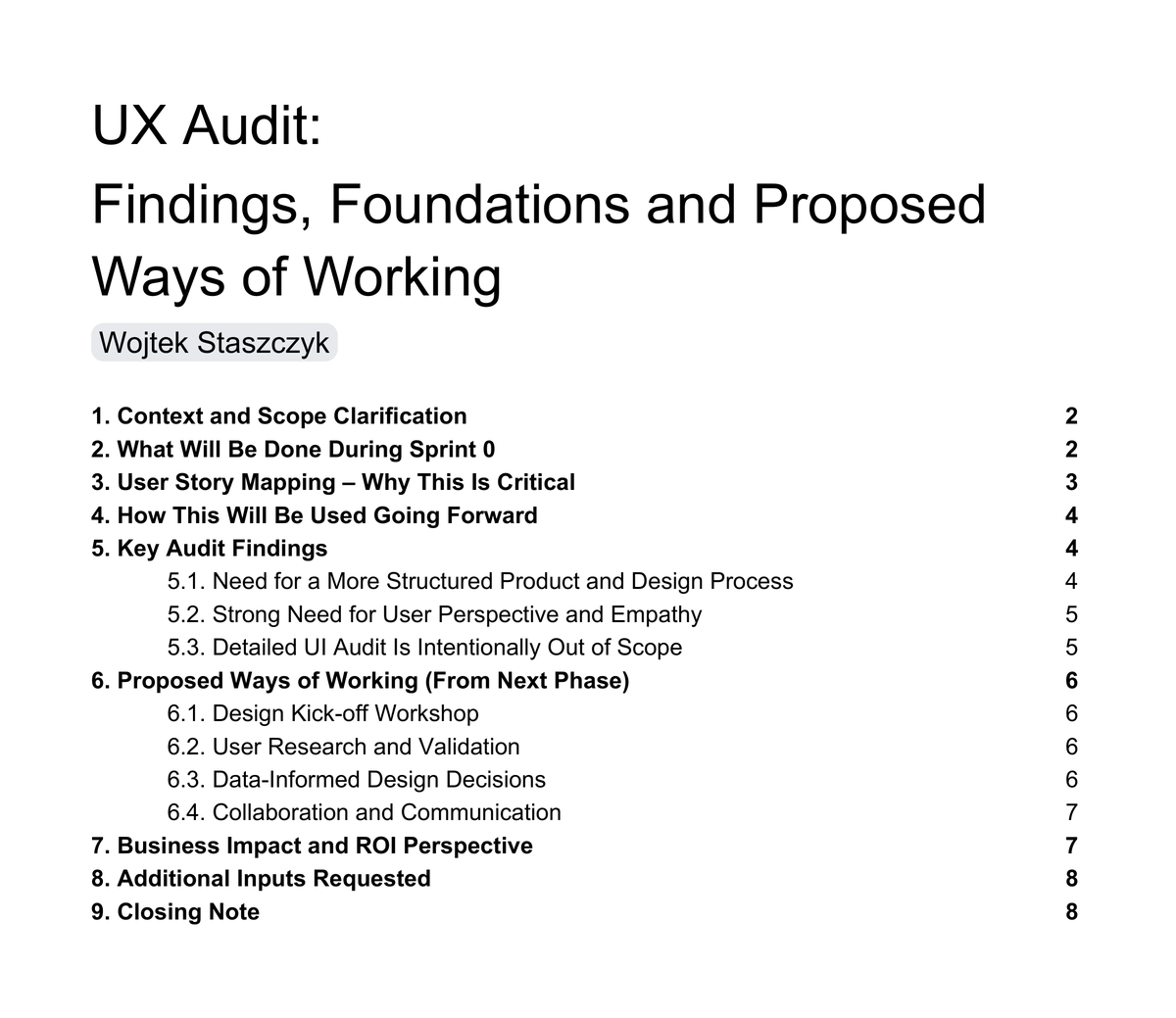
Starting with a UX audit was the client’s idea, not mine. Stakeholders proposed it - and the proposal itself told me how they understood design, and therefore how they understood my role. What they meant by “UX audit” was a UI-level review of the app they already had: what could we do to improve the look and feel of the existing screens.
That wasn’t naivety. It was a reasonable inference from the only kind of design work they had ever seen up close. So I delivered the audit - and made its opening section an argument about its own scope.
A
Understanding before optimizing
Sprint 0 was for learning how the system actually worked end to end - not for critiquing screens. So I put the UI audit explicitly out of scope in the report itself, as section 5.3: interface conclusions drawn without real understanding of user context and system behaviour would be premature, and expensive to unwind.
And I used the same report to argue for something: that user story mapping had to come before any interface work. That argument is section 3, and it is the reason the next six weeks looked the way they did.
The contents page is the argument. Point 3 makes the case for story mapping before any interface work; point 5.3 reads “Detailed UI Audit Is Intentionally Out of Scope.”
B
Arguing it in their terms, not mine
Refusing a request is only useful if you replace it with something the business can see the value of. So I didn’t argue it as a design principle. I argued it as cost.
The argument
In a complex, multi-role, regulated platform, decisions made without understanding generate hidden rework - and late-stage change is the expensive kind.
The report also carried my own ROI reasoning and a proposed way of working for the phase after. It was accepted, and it set the shape of everything that followed.
Making the system visible
One artifact, three audiences
What those two weeks produced was an end-to-end user story map holding two journeys in a single artifact: the admin side the internal team works in, and the natural-person onboarding an investor goes through. Activities across the top, the steps beneath them, the user stories under those, and the gaps and pain points underneath that.
LP Portal AdminInternal team
4 activities
01User management
02Data rooms
03Tasks across the portal
04Communications
Natural person onboardingInvestor
12 activities
01Start onboarding
02Create entity
03Investment details
04Banking information
05Signatories
06FATCA / CRS
07Professional investor questionnaire
08Source of funds
09Document checklist
10Review & approvals
11Sign agreement
12Closing
16 activities51 steps109 user stories5 roles
The backbone only - every activity above has steps under it, and stories under those. Five roles run through it: fund manager, KYC officer, prospect investor, existing investor, and the system itself. The board is genuinely unreadable at any zoom that fits a page, so the detail is one click below.
It was the first time the whole system was visible to everyone at once. It became the backlog engineering worked from, the roadmap the business read, and my own design sequence - which is why nobody had to be sold on it separately.
A
How it was actually built
This is the part I’d want to be asked about. The input was transcripts. The team walked me through the platform across several sessions - how each service worked today, and how they wanted it to work. Hours of recordings.
I ran those through a skill I wrote myself in Claude Code. Not a prompt - a written-down version of my own design process, so the agent reads the transcripts and returns the map in the structure I had already defined.
I wasn’t delegating the thinking
I was delegating something I’d have done myself anyway - it just does it a great deal quicker. Writing it down as a skill is the part I’d actually point at: triage first, so it can’t run heavy process on a small problem. Five phases, each with exit criteria it can’t skip. Checkpoints back to me. That file is where the control lives.
I trust it about ninety percent, and the ten percent is the whole point. It is fast and it is literal, so it will hand you a clean, confident map of a system it has misunderstood. Nothing went on the board until I had checked it against the source - and what it got wrong were exactly the things only someone who sat in those sessions would catch.
So the checking wasn’t a step at the end. It was two review anchors built into the process. First mine: I read the output on its own terms and made sense of it before anything was drawn, then rebuilt the map by hand in Miro. Rebuilding is slower than importing, and that is precisely why it works - you cannot place a card you don’t understand. Then theirs: once the map stood up, I walked the stakeholders through it, to confirm we hadn’t missed anything and that what was on the board was actually right.
B
And it did one thing I didn’t expect
It surfaced what we had missed - non-standard states, error cases nobody had raised, and financial logic already written into the PRD that the team had dropped along the way.
I didn’t use AI to draw. I used it to find what we’d missed in a regulated system.
The domain model
The first real problem was language
There was a genuine language barrier. The system, the domain and the target users were all hard to hold at once, and the vocabulary wasn’t shared. The company also struggled internally to define its own clients - who they are, what they need, what problems they have. Part of my job became structuring and unifying that.
A
One word, two meanings
The clearest example: “investor” meant one thing to the business and something else in the database.
An entity commits capital
The legal party making the investment. This is what the business means by “investor”.
A user logs in
A person with credentials and permissions. This is what the system meant by it.
Entity
Commits the capital
1 : many
UserAn assistant
UserLegal counsel
UserA CFO
… and more
Each logs in separately · five distinct roles · one shared onboarding task
Until that was separated explicitly, invitations, permissions and the whole review model were unbuildable.
This is the layer most portfolios skip. It is also the layer that unblocked the build.
Proposing a way of working
The design kick-off
Before designing anything, I ran a design kick-off. Nobody there owned the product side. There was no product culture to inherit, no long view to lean on, and a deadline that wasn’t going to move. I couldn’t wait for a way of working to emerge, so I proposed one.
And I built that proposal out of how they already worked - how they started projects, how they validated ideas, how decisions actually got made, how people collaborated. Not a generic playbook. A read of this organisation.
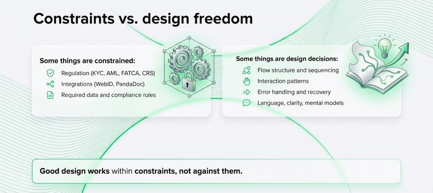
On the left, what is fixed: regulation - KYC, AML, FATCA, CRS - the integrations, the required compliance data. On the right, what is genuinely ours. I drew that line in week one so we’d stop re-litigating what was already decided.
A
What it settled
01
What “good design” means here
Not visual innovation. Helping users do the right thing correctly, in a system where the wrong thing is expensive.
02
Project-level design principles
Progressive disclosure of complexity, explicit system states, clear ownership. When in doubt, we come back to these.
03
Constraints vs design freedom
What regulation fixes, and what is actually a design decision. Drawn explicitly, in week one.
04
A decision-making model
Who decides what, and how conflicts resolve. Clarity over hierarchy - not seniority.
B
Definition of “Ready for Development”
I also wrote down what “ready” actually means. Nothing reaches development until all six are true:
The user goal is clear
Happy path and key edge cases are covered
States and errors are defined
Compliance is addressed
Acceptance criteria are written
Engineering has reviewed feasibility
Remember this one - it comes back at the end.
C
And then it had to become a week
A way of working that only exists in a kick-off document is a document. What I had written down was “regular design syncs, short and focused” - the kind of line everyone agrees with and nobody schedules. So I put it in the calendar. Three fixed touchpoints a week, and heaviest at the start, when none of us had worked together before and a misunderstanding was at its most expensive.
Mon
Tue
Design review
Work in progress, with the designers.
Wed
Stakeholder review
Decisions, with the people who own them.
Thu
Design review
Second pass, before anything hardened.
Fri
Ad-hoc conversations not counted · there were plenty
Three of five working days carried a fixed review. That is a lot of meetings, and I’d defend every one of them: we were moving quickly through a domain none of us fully shared yet, and the alternative to staying aligned weekly was finding out monthly.
I proposed these and they were adopted. That is a different claim from “I redesigned the organisation,” and I want to be precise about which one I’m making.
Designing without decisions
The flow, and the questions attached to it
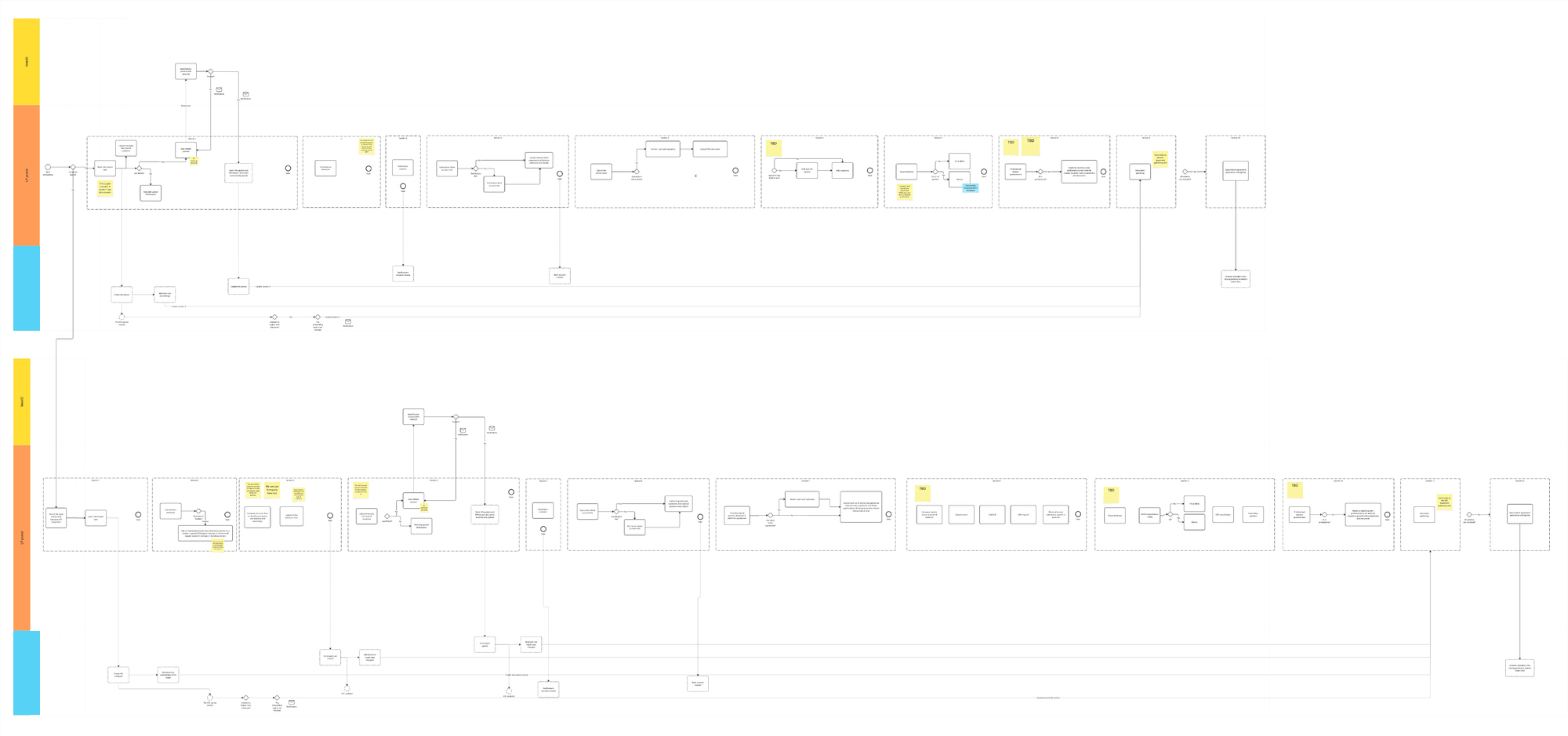
The end-to-end onboarding flow, drawn for engineering. Three swimlanes - the identity provider, the investor-facing portal, and the back-office platform. Ten sections, each with its own review gate.
Don’t try to read it - the density is the point. Every yellow note is a decision that hadn’t been made yet.
A
The product definition wasn’t stable, so I designed explicitly instead
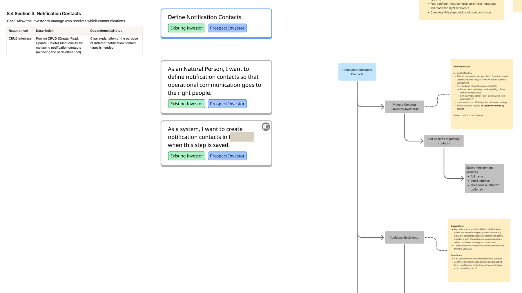
Designing “correctly” wasn’t available - too much was undecided. So for each section I documented the requirement, the user stories, the flow, and my own reading of every rule attached as a note, addressed to whoever owned that decision: my understanding is X - can you confirm this is correct?
One name is redacted here under the anonymisation described at the top of this page.
It turned a decision bottleneck into a queue of specific, answerable questions. Much harder to defer than “any update on the requirements?”
B
Nothing moved forward unreviewed
Written questions only work if somebody answers them, so I didn’t save them up for a milestone. Each flow, or each part of a flow, was reviewed the moment it was solid enough to hold a conversation - live where that was faster, asynchronously where it wasn’t. Never a batch of finished screens revealed at the end.
It is the same anchor I used on the story map, one level down: I review it myself first, then the people who own the decisions review it with me. Two passes, always in that order, each small enough that neither one is an event.
Options considered, and rejected
The multi-currency decision
This is the design decision I’d defend hardest, and the reason is a domain fact rather than a design preference.
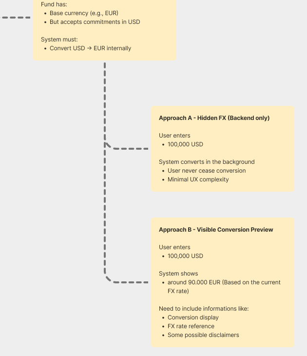
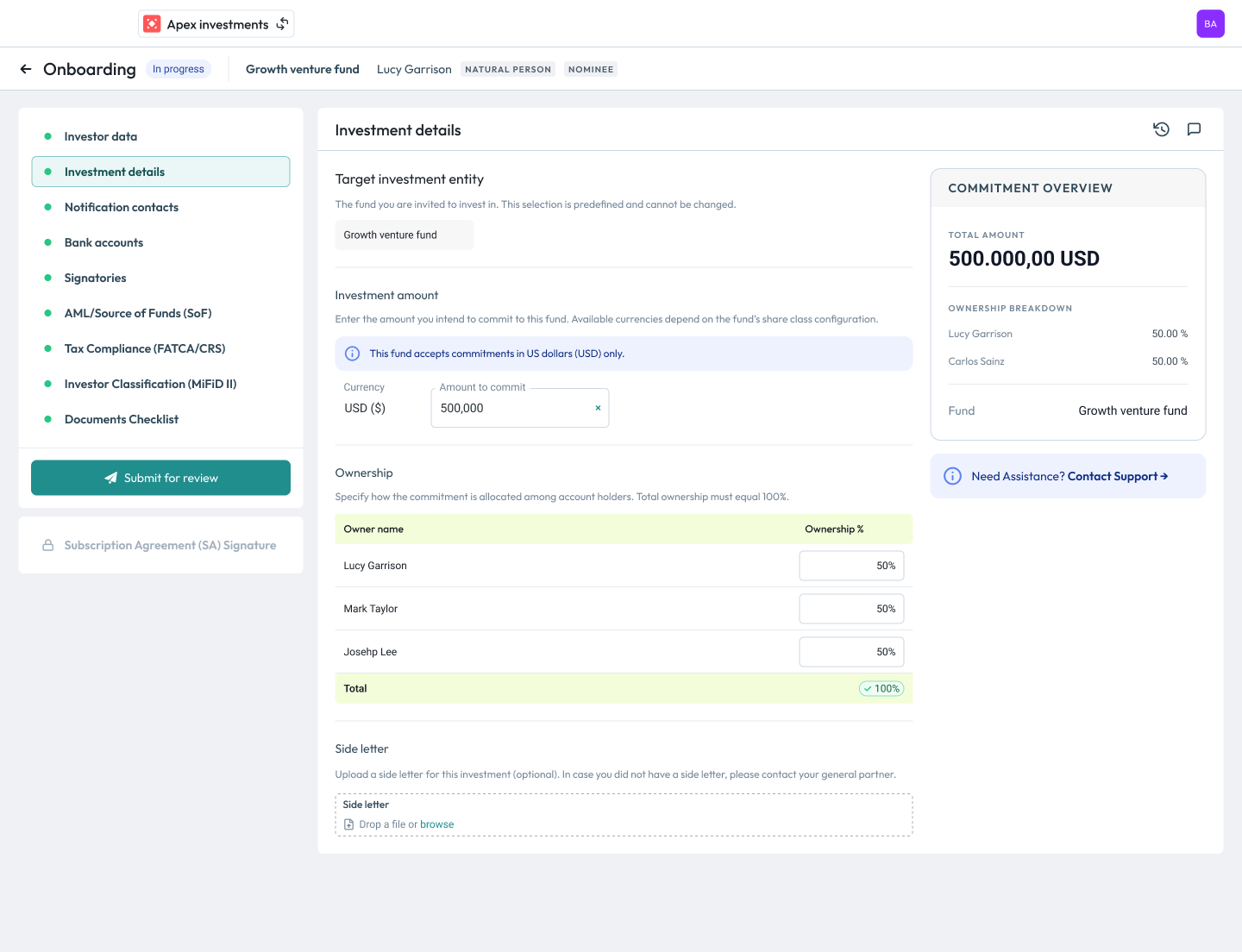
The problem: a fund has a base currency - say EUR - but accepts commitments in other currencies, say USD. The system must convert and store the commitment in the base currency. So: does the investor see the conversion?
Approach A - hidden FX
The investor enters 100,000 USD. The system converts in the background. No conversion is ever surfaced. Minimal interface complexity.
Approach B - visible conversion
The investor enters 100,000 USD and sees roughly 90,000 EUR at today’s rate. Needs an FX reference and disclaimers. Feels more honest.
What settled it
The client’s product decision-maker pointed out something I couldn’t have known from the interface alone: the rate shown at commitment isn’t what the investor will actually pay, because it is adjusted daily. Approach B looks like the transparent option, but it puts a number on screen that reads as a promise and isn’t one. A number that looks like a commitment and isn’t is worse than showing none at all.
So the more “honest-looking” design was the less honest one. That only becomes visible if you understand how the domain settles money - which is exactly why I spent the first two weeks learning the language instead of drawing screens.
To be precise about what I’m claiming: this is the decision we took and the reasoning behind it. The work did not reach general availability before my engagement ended, so I can’t tell you how it behaved in production.
Method
From a hand sketch to a prototype in code
One honest thing first. I use AI as far as it genuinely helps, without the hype - and I’m still finding the right balance. I’d rather say that than pretend it’s settled.
A
Back to the roots
By this point the kick-off was aligned, the story map approved and the system understood - and we were designing something genuinely new. That is exactly when the tools and the methods start getting loud. So I went back to key screens and key states, sketched by hand: proportions, what sits where, which states actually matter.
The raw working sketch, arrows and all. Open it to see the shipped screen as the second slide. Two things are worth comparing: the proportions I guessed here - list ≈35–40%, detail ≈60–65% - are the proportions that shipped. And the one question I left open on the page, where the events log belongs, was drawn twice and answered once: it went in the header.
AI made everything around this faster. It didn’t replace this part.
B
So when doesn’t it start with a sketch?
This project was also where I was working out how these tools fit at all. At the high-fidelity stage I brought in Figma Make as a source of inspiration - not to produce the design, but to get out of my own head when a solution wasn’t arriving. The hard part was never the tool. It was finding the right moment in the process to reach for it, and being honest about when reaching for it was avoidance.
What I settled on is a rule I can state, which is the only version of this worth putting in a case study:
A screen to design
If · new territory
The screen introduces functionality and interactions the product hasn’t had before. There is no pattern to lean on.
Then
Sketch it by hand
Start at zero on the iPad. Proportions, what sits where, which states matter.
If · known pattern
The pattern already exists in the system - and I’m struggling to translate it into a solution for this case.
Then
Generate variations
Figma Make, for inspiration only. Something to react to, not something to ship.
The prompt was the work
I didn’t prompt inside Figma Make. I wrote the prompt in Claude Code first, and fed it real benchmarks pulled from our own Figma file, so whatever came back was arguing against our system rather than a generic one. Then a handful of variations, and I picked the argument I found useful - usually not the whole screen, just one move in it.
I tried Lovable around the same time, and I’ve since settled on the Claude ecosystem for this kind of work. I’m describing an experiment, not a method I’d sell you. The part I’d defend is the rule above: it decides when the tool is allowed near the problem, which is the question that actually matters.
C
How I actually worked
Once the information architecture and the flow were settled - and I had answers to the questions I’d raised against them - I moved into ideation. Four tools, in this order, each doing one job:
Step 01
Figma
Ideation and the screens themselves. The designs were done here - not generated, not reverse-engineered from code.
Step 02
Claude Design
Adapted the existing design system into a cohesive component library - carrying the system across, not screenshots.
Step 03
Claude Code
Prototype assembled from those approved components - not new UI invented on every screen.
Step 04
Netlify + GitHub
Deployed and versioned - so it could actually be tested by real users and handed over to engineering.
The order matters. Figma first, for the designs. Code for the prototype - not code instead of Figma.
Building it that way bought two things a clickable file can’t:
Real usability testing, internal and external, on something users could actually break.
A cleaner handover to engineering, because the behaviour was demonstrable rather than described.
And where it stopped
A working prototype feels like a solved problem, so the wrong thing gets built quickly and convincingly. I set evaluation checkpoints and validated output against my own craft rather than accepting it. Also, prosaically: token limits. Speed up the work; don’t shortcut the thinking.
Interface decisions
The component library answered a different question
By the time I moved from sketches into Figma, a component library already existed. It was the other designer’s work, and it did its job - it held the existing product’s interface together and kept it consistent.
But I was designing something new, and by then I was carrying scenarios, edge cases and user stories the library had never been shaped around. It could tell me what a component should look like. It couldn’t tell me what that component should do in the situations I now knew about.
That isn’t a criticism of the library. It is what happens when the interface layer gets built before the system underneath it is understood - the same gap this whole project was about, showing up one level down.
So I set out to evolve it, not replace it - the same library, extended one component at a time to carry the use cases discovery had surfaced and the original build never had reason to cover.
A
So I took them apart, one at a time
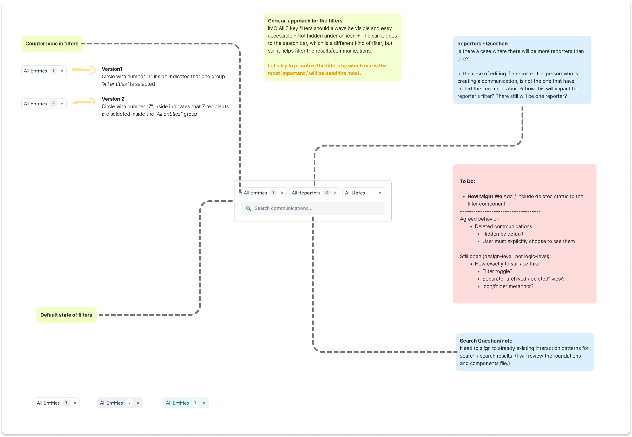
The filter bar. A single item in a list. For each one I went back to first questions: what is this element actually for, what is the user’s recognition hook, what varies between instances, what is the default state, and which control has earned the most prominence.
One component, its variants, and the reasoning attached to each. Every component left the file carrying four things:
What left the file with every component
01
The reasoning
Why the element exists, and what it has to do.
02
The alternatives
Versions I considered and set aside, kept side by side rather than deleted.
03
Open questions, with an owner
Addressed to whoever could actually answer them.
04
Agreed, and still open
Split between what was settled at the logic level and what was still a live design question.
B
Every decision left the file with its argument attached
Decomposing a single row
The metadata line on a communication card was a sentence pretending to be a row: “It was [status] at this [date] by [this user].” Once it was written that way, the three elements had an order, a grammar and a reason to exist - and three candidate versions of that row could be compared against something other than taste.
Nothing arrived at review as a preference. Every decision came with its argument, and every unknown came as a named question rather than a quiet assumption.
C
Then the file stopped being mine
Working this way produced something I hadn’t planned for: a document other people could argue with.
The first person I brought into it was the designer who owned the library - into it, not around it. The misalignment was never his to have predicted, and routing around him would have produced two competing systems inside one product. So I came with specific cases his components couldn’t yet express, and with proposed changes to the library to cover them. That is a very different conversation from “I don’t like this component,” and it is why the proposals were taken up rather than defended against.
Then it widened past design entirely. Product managers, engineers, financial analysts, other specialists - each annotation was addressed to whoever could actually answer it, and the file became the place the answer was recorded, next to the thing it governed.
Why that beat holding a meeting
A financial analyst can’t critique a layout, and shouldn’t have to. But they can tell you whether a rate shown at the moment of commitment will read to an investor as a promise. Breaking screens down into decisions gave people with no design vocabulary a way to contribute their expertise instead of their taste - and the answers landed on the artifact rather than in somebody’s inbox.
D
What the deconstruction actually bought
Review changed shape
A finished screen invites opinions. A component carrying its reasoning, its alternatives and its open questions invites decisions - so reviews returned answers instead of adjectives.
Every unknown got an owner
An assumption quietly baked into a component surfaces at build time, as a defect. A named question with a name against it gets answered in a day, while changing the answer is still cheap.
The design system got evidence
Not complaints - concrete cases the library couldn’t yet express, each with a proposed change. Evidence is arguable; taste isn’t, which is why taste stalls.
It outlived the conversation
Each settled component became a precedent and a piece of documentation. The reasoning stayed readable after the meeting ended - and after I did.
And this is where the Sprint 0 promise got paid. The audit had put the UI audit explicitly out of scope and said interface work would come later, once there was real understanding of user context and system behaviour. This is what “later” looked like.
Outcome
Validated, not proven
A
Success was defined up front
Agreed with the client before the work started, as targets: a 50% reduction in time-to-onboard, 70% less internal manual effort per investor, and 70% fewer compliance follow-up requests.
I’m listing them because defining them was part of the work. They are targets, not results. No baseline was ever captured, so nothing was measured against them.
B
What I did validate
I ran moderated sessions myself - with the internal KYC team on the admin panel, and separately with onboarding users on the investor portal - both against a working prototype. That sat on top of a continuous feedback loop: updates several times a week and a weekly status sync, so nothing reached that study cold.
C
The outcome I’m proudest of is cultural
The mandate shifted from velocity to quality. The product owner started asking for acceptance criteria, checklists and a real “ready for development” gate - the thing I had proposed in week one. That outlasted my engagement, which is a better test of it than my opinion.
And the honest part
It never reached general availability while I was there, so it was never measured in production. I have the targets and I have the validation. I’m not going to give you a number I didn’t measure.
Reflections
What I’d do differently
I’d have fought for the baseline measurement
It was written into the Sprint 0 scope. It never happened. If we’d captured time-to-onboard and manual effort in week two, the study I ran later would have had something to compare against - and this page would end with a number instead of a caveat. I let it slip. That is the weakest decision in this project and the first place I’d push if I were reading it.
I’d separate the domain model from the delivery pressure sooner
The entity-versus-user distinction eventually unblocked the build. Found in week one instead of week three, it would have saved a round of permission rework.
I’d write the assumption notes from day one
The “my understanding is X, confirm?” pattern worked so well that I now think of it as the default way to work under ambiguity, not a workaround for a bad situation.
I’d be clearer about what a consultancy can change
We were engaged to improve the implementation, not the strategy. Most of my leverage came from proposals that were adopted, not decisions I owned. Knowing that earlier would have made me choose my battles better.
The through-line
A design system is a constraint system for the interface layer, a domain model for the product layer, and a team topology for the organisation. What I actually do is make the implicit constraints of a complex system explicit - so that people, and now agents, can work inside them without breaking things.